

Re-ignite aliveness
re-build connection
Re-ignite aliveness
re-build connection
Re-ignite aliveness
re-build connection
Relationship and psychosexual therapist bringing a hopefullness that things can change
We began working with Rachel at an inflection point. Having built a successful therapy practice, Rachel was looking to add more public-facing layers to her work, as well as bring more focus to relationship and psychosexual strand of her practice. The tension was in carrying the energy and approach that Rachel brings, whilst holding the seriousness of the work itself.
Re-ignite aliveness
re-build connection
Re-ignite aliveness
re-build connection
Re-ignite aliveness
re-build connection
Unearthing the difference from other practitioners
My task was to help Rachel find a vantage point that gets lost when an expert is close to the work, and identity what defines her practice and sets her apart from other psychotherapists.
We travelled deeper into her personal story to arrive at the core to the way she works, and the personal experiences that drive her practice day to day.
Having landed on something specific and something personally important to Rachel, I explored it deeper and translated it into a visual system that forms the identity.
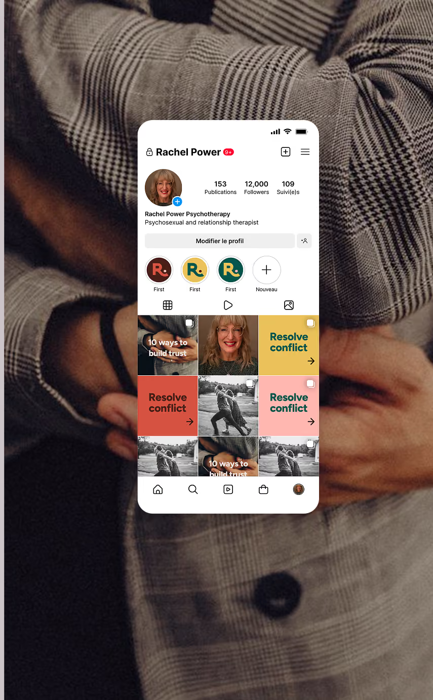
The palette
We wanted to strike a balance between communicating the energy Rachel brings, the sense of hopefulness and aliveness she works to ignite, alongside communicating the depth of her experience. We also wanted to make the right person feel at home when they land on the site.
Most therapist brands want to create safety and lean on neutrals to communicate it. But in this way most practitioners become interchangeable. Rachel’s vision and story opened space for a warm, vibrant palette that sets her apart within her niche.


Typography
We wanted to carry that sense of activity and confidence in the typography too. I selected a rounded, and slightly humanist font. One that’s modern, without feeling overly mechanical and reads as approachable.
The letters have a spacious feel which gives them improved readability - something that’s especially important for someone who’s searching for answers on their phone at midnight.
Logo
The idea of ‘congruence’ is particular to Rachel’s practice and I wanted to carry this across within the way the design behaves.
The logo mark takes the curve of the R, assembled out of separate shapes like a puzzle. Initially it seemed that the R on its own felt inconclusive, so I added a full stop which does two things - it adds a playfulness but also gives an impression of the shape being held, which adds a layer of intimacy to the form.
The logo system contains 4 different logo types, each made for different use cases, but each is anchored in Rachel’s own signature.


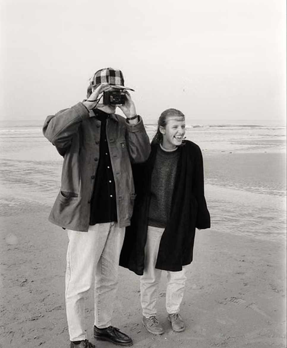

Supporting images
To allude to intimacy without being explicit I borrowed from fashion - selecting still life, fruit and flowers. This also helped re-enforce the feeling of a warm summer evening, especially through choosing images that had soft lighting and taken on 35mm.


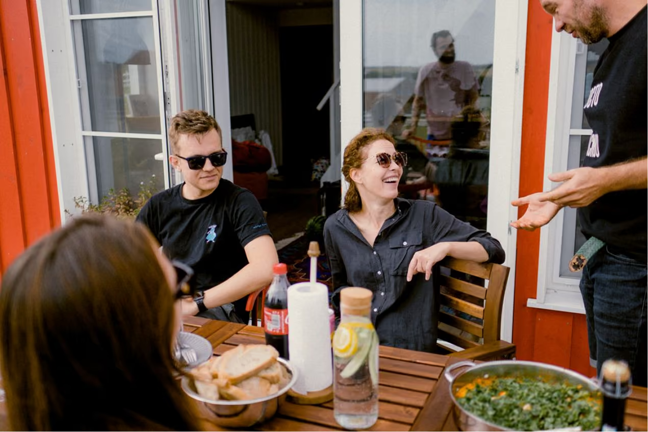

Supporting images
To allude to intimacy without being explicit I borrowed from fashion - selecting still life, fruit and flowers. This also helped re-enforce the feeling of a warm summer evening, especially through choosing images that had soft lighting and taken on 35mm.
The website
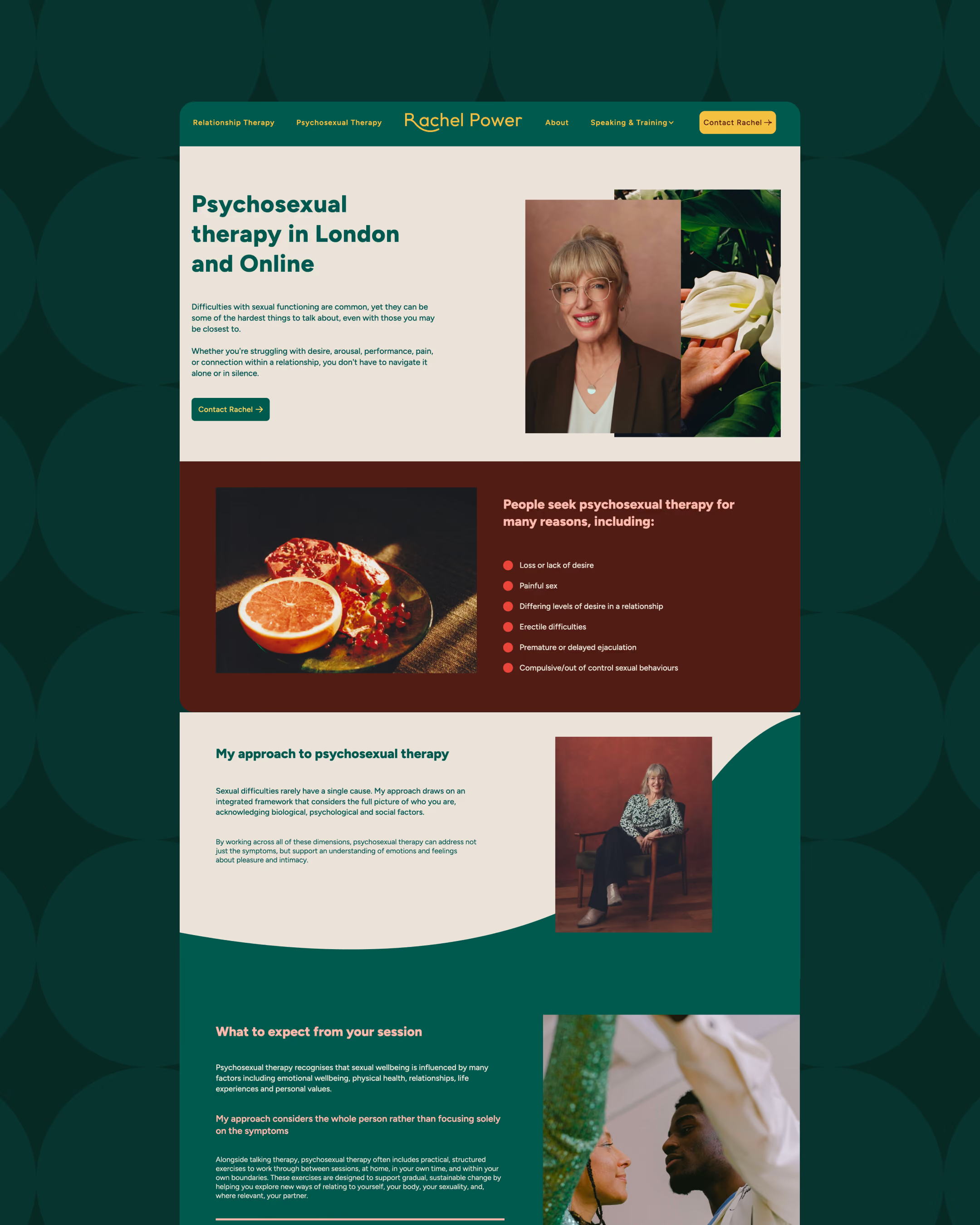
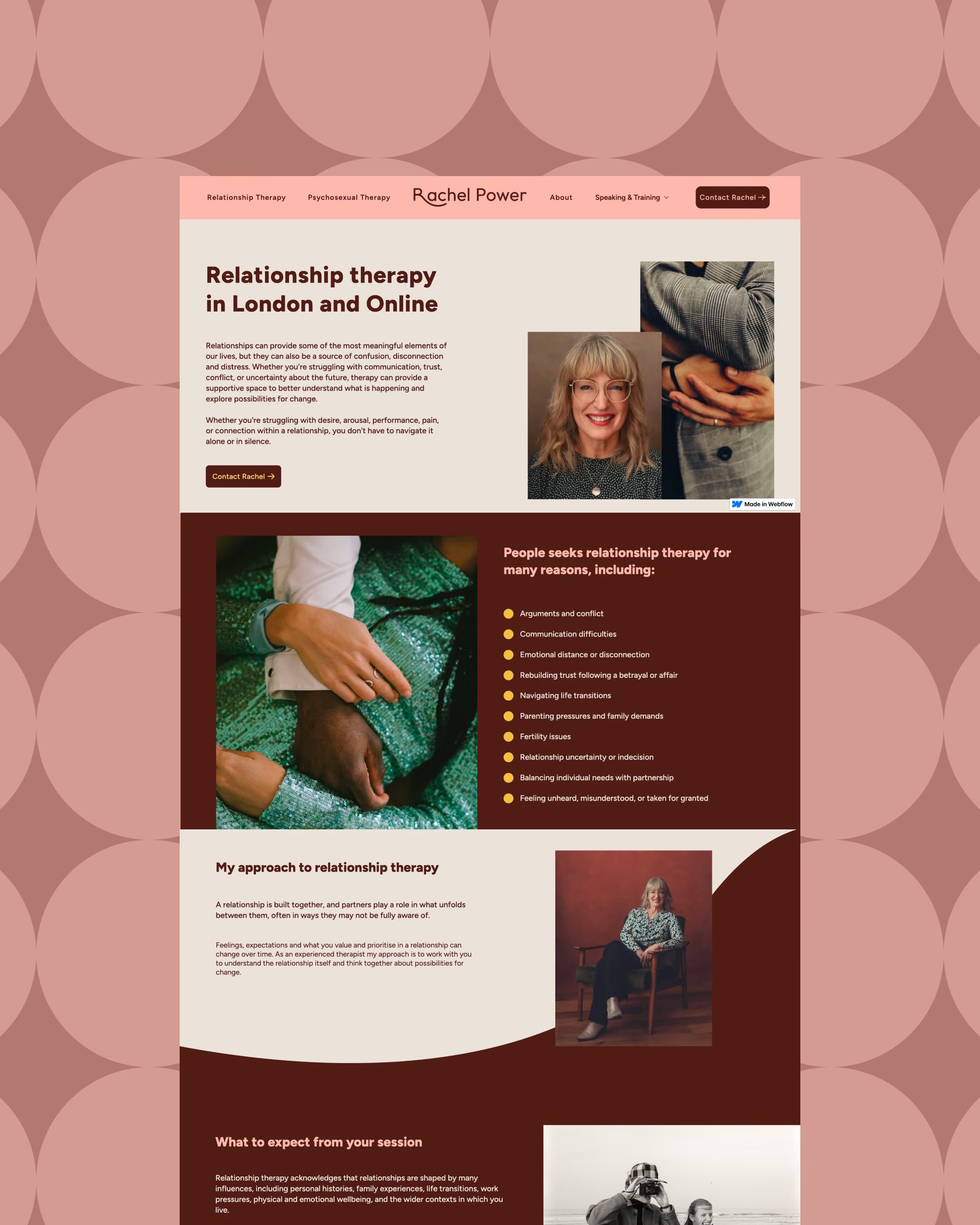
The identy does most of the heavy lifting in communicating Rachel’s approach. So the website itself pulls the client into focus.
During my research I found that feeling seen was one of the key decision-making factors when people searched for a therapist - so the problem (or symptom) section was given prime real estate.
The other key factor was fully understanding how the process works, so each page pulls into focus specific questions through FAQ’s, and explanations of what happens at each step of the engagement.
Strategic goals that the brand and website work to accomplish
An identity and website that support Rachel in deepening her practice as a psychosexual and relationship therapist, balancing both the energy she brings and the depth and seriousness of the work.
Positioning Rachel as a strong voice within her space, with experience and a point of view.
Support Rachel in confidently moving between spaces and adding more public layers to her practice - workshops, speaking, training and beyond.
Attract the right type of client, so that more time is spent on solving the right problems.
Supporting a pricing point that's accessible to private clients, communicates expertise and has room to grow.
Book a friendly 30 minute chat to ask me any questions and see if we're a good fit
Book 30 minute chat